Dynamic Grading’s histogram views are still a quite unfamiliar sight in the audio world. In this post we show how to interpret these graphs to get valuable insights into your audio’s dynamics.
Introduction
If you’ve edited photos before, there’s a good chance you’ve seen some variation of a histogram. These graphs are a great way to identify how the low, medium and high brightness parts of an image relate to each other. Or in short: to analyze the dynamics in an image. Often you will find these histograms combined with some means to manipulate the brightnesses in the image, which has a direct effect on the histogram.
It’s this way of visualizing and manipulating the information in an image that inspired Dynamic Grading. Only that instead of the brightness of pixels in an image, it works with the loudness of different sound events in an audio recording.
How Dynamic Histograms Work
In Dynamic Grading, audio dynamics are displayed as so-called dynamic histograms. These graphs represent a statistic of perceived momentary loudness over a given length of time. The easiest way to think about it is via the commonly used level meters you know from DAWs and mixing desks:
Now imagine a really fast-moving level meter like the one on the left, and a superhuman statistician sitting in front of it, looking up the level on the meter really often and keeping a tally sheet of how often she or he reads each possible value over – say – the last 20 seconds. The result is plotted as a bar graph like the one on the right. In the example above, you can see that values around -40 dB have occurred much more often than values around -50 dB or -16 dB, as an example.
This kind of graph tells us a lot about the dynamics of audio recordings. It reveals the dynamic range (the highest and lowest readings) as well which loudness regions are most prominent and how much perceived loudness varies (= how dynamic it is).
A sharp peak in the graph hints at a static tone, note or noise with a constant level, while a broad and flat shape means there is a lot of dynamic variation.
A Simple Example
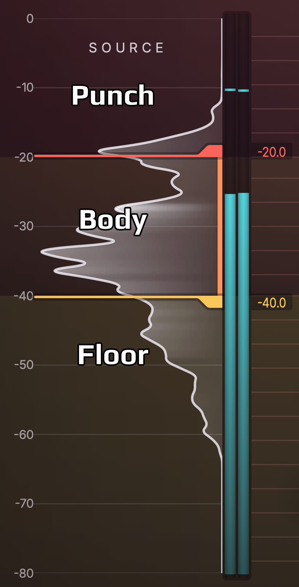
So let’s look at a simple example from the real world. Below you see a dynamic histogram of a synth bass arpeggio pattern. You can see that it looks kind of like a smooth bell curve. Due to the regular and repetitive pattern in the audio, we get a poster child that helps us establish some rules to identify important parts of the histogram.
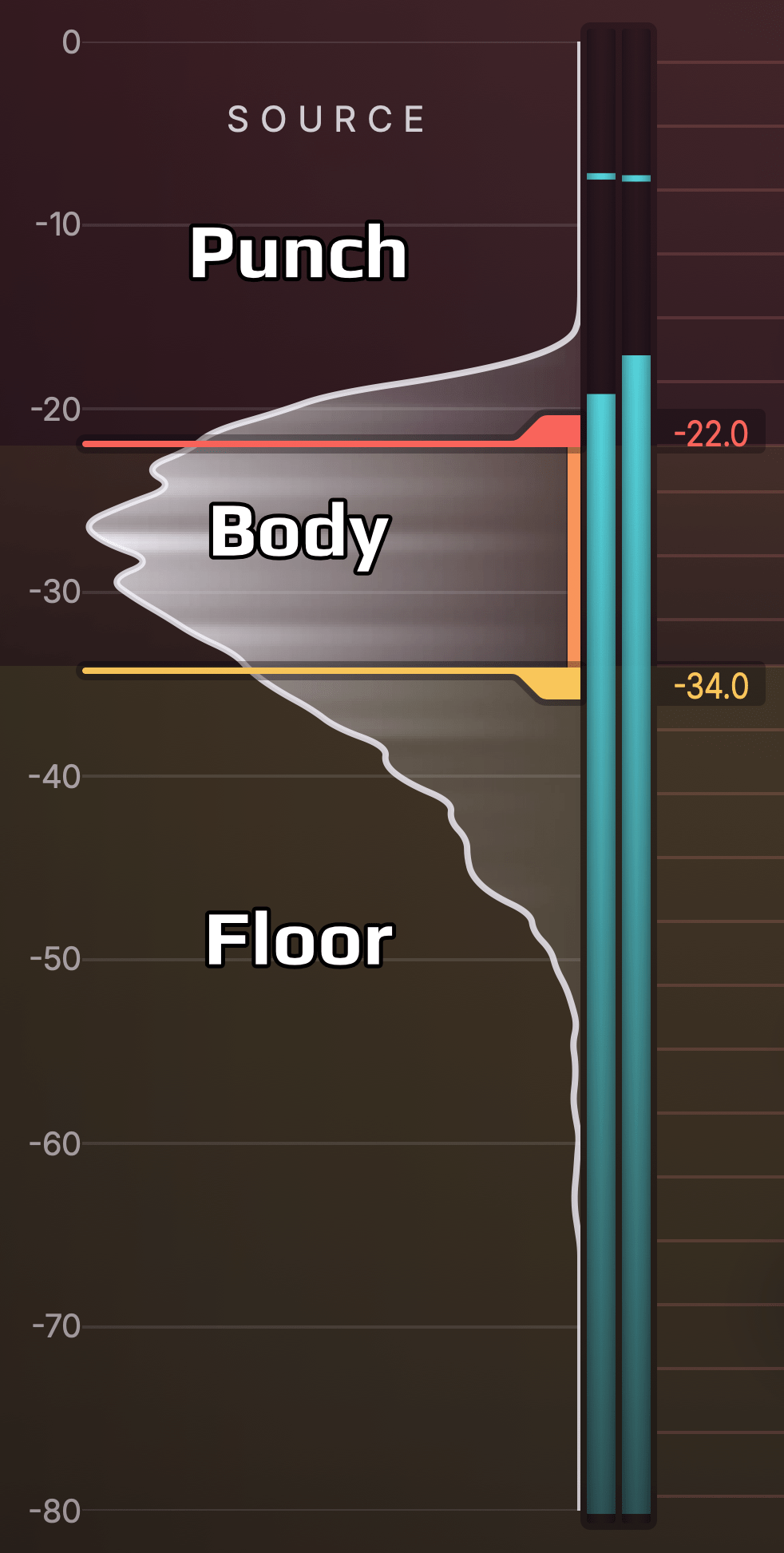
The bulky maximum of the bell curve tells us where in the dynamic range most stuff is happening. We call that range the “body” of the signal, because this is usually where the most important musical information is located. For most instruments – as in this example – these are the sustain phases of notes. The body range is usually what carries what we perceive as pitch and timbre of an instrument. It also plays a significant role in the perception of overall loudness and the dynamics of the “player”.
Many instruments such as this bass synth feature a significant onset or attack, which is louder compared to the body range, but only for a short time. That’s why in dynamic histograms, you’ll often see a decay towards higher levels. This range is what we’ll refer to as the “punch”. When an instrument features very pronounced and percussive attacks, the punch range will stretch farther out from the body. When attacks are less pronounced, the decay towards higher levels will be shorter.
The third range worth noting is what happens below the body range. This is where lower level sound is located. That’s why we call it the “floor”. In this floor range, you find the decay of stopped notes, reverberation and echo, as well as the noise floor if there is a significant one. The floor can be best described as the “space between the notes”.
More Complex Example
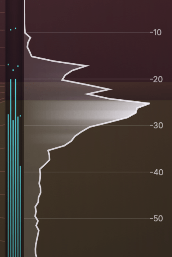
Let’s look at a more complex example. Below you see the dynamic histogram of a drum bus. It looks much more jagged, but nevertheless we can roughly identify body, punch and floor ranges here as well.
In this case, different drum instruments (like kick drum, snare, hihat) are involved, which also cover a broader dynamic range. Thus, the body range is not as “belly” or “bulky”. Also the floor range is thicker, because the room and instrument decays are more pronounced. Finally, the punch range has its own peak, because main kick and snare hits are louder than the hihats and ghost notes, which are more located in the body.
These are only two examples of a wide variety of audio tracks. When you start using Dynamic Grading on different instrument and vocal recordings, you will encounter patterns very similar to those we’ve seen here. Most real world audio tracks exhibit some flavor of punch, body and floor ranges.
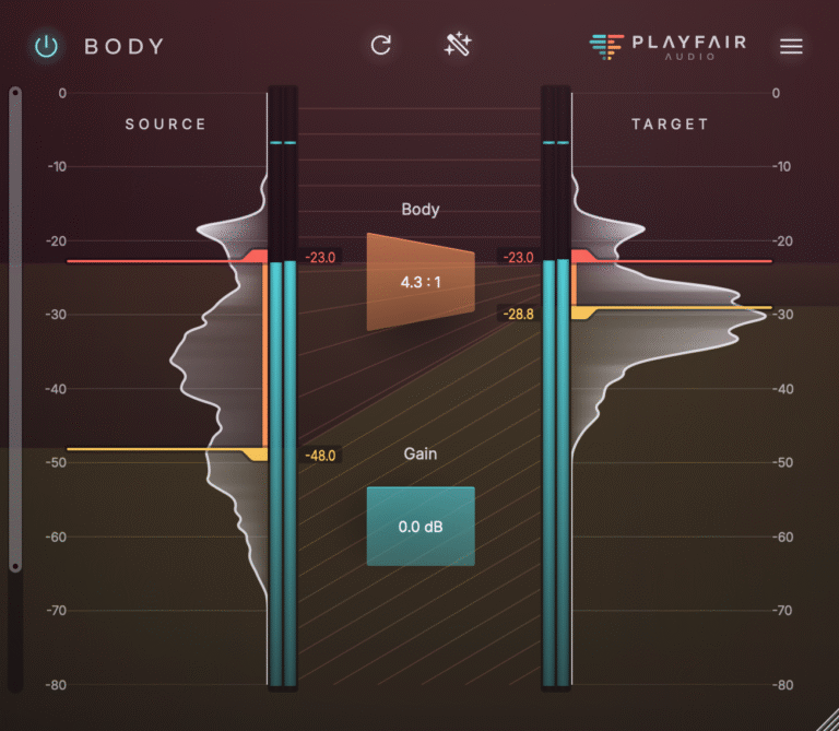
When using Dynamic Grading, the first step is always to identify the body range, either manually by moving the source markers, or automatically using the Source Learn button. After doing that, you can start shaping the dynamics to your liking. Learn how in Manipulating Audio Dynamics For Fun & Profit.